I've sat through dozens of executive meetings where marketers present GA4 dashboards filled with sessions, bounce rates, and pageviews—only to watch executives' eyes glaze over within minutes.
The problem isn't that executives don't care about data. It's that most GA4 dashboards are built for marketers, not decision-makers.
After building analytics systems for dozens of clients at Bora Media Network, I've learned that the difference between a dashboard that gets ignored and one that drives decisions comes down to three things: relevance, clarity, and action.
Here's how to build a GA4 dashboard your exec team will actually use.
Why Most GA4 Dashboards Fail in the Boardroom
Let's be honest: executives don't care about sessions.
They care about pipeline. Revenue. Customer acquisition cost. Whether marketing is pulling its weight.
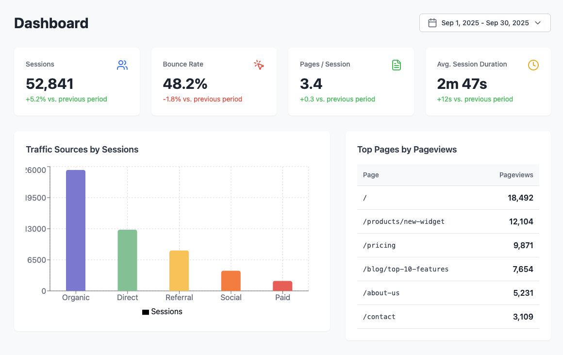
But most GA4 dashboards look like this:
- Total sessions: 47,832
- Bounce rate: 52.3%
- Average session duration: 2:34
- Pageviews: 143,291
This data might be useful for optimizing campaigns, but it tells executives absolutely nothing about business performance.
The result? Your beautifully crafted dashboard gets a polite nod and never gets opened again.
What Executives Actually Want to See
Before you open GA4, ask yourself: What decisions do executives need to make?
In my experience working with leadership teams, they typically want answers to these questions:
- Is marketing generating revenue? (Not traffic—revenue)
- What's our customer acquisition cost? (And is it sustainable?)
- Which channels are working? (Where should we invest more?)
- Are we improving over time? (Month-over-month and year-over-year trends)
- What needs attention? (Red flags, opportunities, anomalies)
Your GA4 dashboard should answer these questions at a glance. Nothing more, nothing less.
The Framework: Build for Business Outcomes, Not Marketing Metrics
1. Start with Revenue Metrics
Put revenue front and center. Not sessions. Not clicks. Revenue.
Key metrics to include:
- Total revenue (current period vs. previous period)
- Revenue by channel (organic, paid, direct, referral, email)
- Revenue per user
- Conversion value trends over time
If you're B2B and revenue tracking is complex, use lead value or pipeline contribution as a proxy. The point is to connect marketing activity to business outcomes.
Pro tip: Set up enhanced ecommerce or custom events in GA4 to track conversions properly. If you're not tracking revenue in GA4, fix that before building any dashboard.
2. Show Efficiency Metrics
Executives care about ROI. Show them how efficiently marketing dollars are being spent.
- Cost per acquisition (CPA) by channel
- Return on ad spend (ROAS)
- Customer lifetime value to CAC ratio (if available)
- Conversion rate by traffic source
If your GA4 isn't connected to ad platforms, integrate Google Ads and other paid channels so cost data flows automatically.
3. Display Channel Performance
Executives need to know which channels are driving results so they can make investment decisions.
- Traffic by source/medium (with revenue attribution)
- Conversion rate by channel
- New vs. returning user split by channel
- Top converting landing pages
Use clear visualizations—bar charts work better than pie charts for comparing channels.
4. Add Context with Trends
Static numbers mean nothing without context. Show how performance is changing over time.
- Month-over-month revenue trends
- Year-over-year comparisons
- Weekly performance patterns (to spot seasonality)
- Goal completion trends
Use comparison periods in GA4 to automatically show percentage changes. Executives love seeing "+23% vs. last month" in green.
5. Highlight What Needs Attention
Don't make executives hunt for problems. Surface them automatically.
- Channels with declining performance
- Pages with unusually high drop-off rates
- Campaigns underperforming benchmarks
- Anomalies in conversion rates
Use annotations in GA4 to mark significant events (product launches, campaigns, site changes) so context is always visible.
Design Principles for Executive Dashboards
Keep It Simple
Your dashboard should fit on one screen. If executives have to scroll or click through multiple tabs, you've lost them.
Rule of thumb: 6–8 key metrics maximum. If you need more detail, create a separate "deep dive" dashboard for your team.
Use Visual Hierarchy
The most important metrics should be the biggest and most prominent. Secondary metrics can be smaller.
I typically structure dashboards like this:
- Top section: Revenue and primary business goal
- Middle section: Channel performance and efficiency metrics
- Bottom section: Trends and context
Make It Scannable
Executives often review dashboards in under 60 seconds. Design for that reality.
- Use color intentionally (green for good, red for alerts, gray for neutral)
- Add clear labels—no jargon or abbreviations
- Include brief insight text boxes (1–2 sentences max)
- Use comparison metrics (vs. last period) liberally
Design for Mobile
Many executives check dashboards on their phones or tablets. Make sure your GA4 dashboard is mobile-responsive.
Test it on multiple devices before sharing.
Step-by-Step: Building Your Executive Dashboard in GA4
Step 1: Create a New Report in GA4
- Navigate to Explore in GA4
- Select Blank to start from scratch
- Name it something clear: "Executive Dashboard - [Month/Year]"
Step 2: Add Your Key Metrics
- In the Metrics section, click the + icon
- Search for "Purchase revenue" or "Conversions"
- Add it to your visualization
Repeat for your other key metrics: sessions by channel, conversion rate, etc.
Step 3: Build Comparison Views
- In Date range, select your primary period (e.g., last 30 days)
- Click Compare and select "Previous period" or "Previous year"
- GA4 will automatically calculate percentage changes
Step 4: Create Channel Breakdowns
- Add "Session source/medium" as a dimension
- Include metrics: Users, Conversions, Revenue
- Sort by Revenue (descending)
Step 5: Add Trend Visualizations
- Add a Line chart visualization
- Set the dimension to "Date"
- Add your key metric (revenue, conversions, etc.)
- Set the date range to show 3–6 months for context
Step 6: Annotate Key Events
- Go to Admin > Data display > Annotations
- Add notes for major campaigns, launches, site changes, etc.
- These will appear on your charts automatically
Step 7: Share and Set Permissions
- Click Share in the top right
- Add executive email addresses (view-only)
- Schedule automatic email delivery (weekly or monthly)
Common Mistakes to Avoid
Mistake #1: Too Many Metrics
More data doesn't mean better insights. Executives are time-constrained. Stick to 6–8 key metrics.
Mistake #2: Focusing on Vanity Metrics
Sessions, pageviews, and time on site are not business outcomes. Connect everything to conversions or revenue.
Mistake #3: No Context or Benchmarks
A conversion rate of 3.2% means nothing without context. Always include comparisons.
Mistake #4: Ignoring Mobile Experience
If your dashboard looks great on desktop but terrible on mobile, it won't get used. Test on multiple devices.
Mistake #5: Building It Once and Forgetting It
Business priorities change. Review and update your dashboard quarterly to ensure it stays relevant.
Advanced Tips for Power Users
Connect GA4 to Looker Studio
For more flexibility and better visualizations, export your GA4 data to Looker Studio and combine with ad/CRM sources.
Set Up Custom Events
Track actions that matter to your business but aren't tracked by default (demo requests, form submits, downloads).
Use Segments to Tell Better Stories
Create segments for high-value users, traffic sources, or customer types to compare behavior.
Automate Insights with Alerts
Configure custom insights for revenue drops, conversion spikes, or channel declines so issues never go unnoticed.
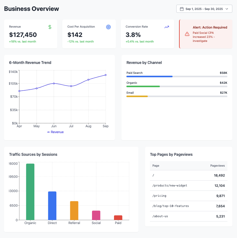
Real Example: Before and After
Let me show you a real transformation (client details anonymized).


Executive feedback (before): “This is interesting, but what does it mean for the business?”
Executive feedback (after): “This is exactly what I need. Send this every Monday.”
The difference? The second dashboard answers business questions instead of presenting marketing data.
What to Do After Building Your Dashboard
1. Walk Executives Through It
Don't just email the link. Do a short walkthrough to align on definitions and decisions.
2. Set a Regular Cadence
Pick a review rhythm (weekly/biweekly/monthly). Consistency builds trust and usage.
3. Add Brief Commentary
Include 2–3 bullets on what changed and why so leaders don’t have to dig for meaning.
4. Ask for Feedback
After the first month, ask what’s missing or unnecessary—then iterate.
5. Update Regularly
As priorities shift, keep the dashboard aligned. A stale dashboard becomes shelfware.
The Bottom Line
Your GA4 dashboard should be a decision-making tool, not a data dump. Start with business questions, connect metrics to outcomes, keep it simple, add context, and make it scannable.
Do this, and you’ll build a dashboard that executives actually open, reference in meetings, and use to make smarter marketing investments—and you’ll move from data reporter to strategic advisor.
Need help building a dashboard that drives decisions? At Bora Media Network, we build custom analytics systems that connect marketing activity to business outcomes. Get in touch.
