Building a landing page that actually gets people to do what you want them to do can feel like a puzzle. You put all this effort in, and then… crickets. It’s frustrating, right? The good news is, it’s not about luck. There are specific landing page elements that make a big difference in whether someone clicks that button or bounces. We’re going to look at seven of these key parts that can help turn your page from just another webpage into a conversion machine. Think of it as a checklist to make sure your page is working as hard as you are.
Key Takeaways
- A strong headline grabs attention immediately and tells visitors what they’ll gain.
- Clearly showing what makes your offer special helps people understand its value.
- Images or videos should show the product or service in action, making it relatable.
- Focusing on the advantages for the customer, not just features, makes the offer more appealing.
- Proof from others, like reviews or testimonials, builds trust and encourages action.
Attention Grabbing Headline
Your landing page headline is the very first thing a visitor sees. Think of it as the handshake – it needs to be firm, clear, and make a good impression right away. If it’s weak or confusing, people will just turn around and leave. Seriously, it’s that important. It has one main job: to grab attention and tell people what you’re offering and why they should care, all in a few seconds.
A strong headline can make or break your landing page’s success. It’s not just about sounding clever; it’s about communicating value directly. Visitors aren’t usually browsing; they’re looking for a solution to a problem or a way to improve something in their lives. Your headline needs to speak to that need.
Here are a few things to keep in mind when crafting yours:
- Be Clear and Direct: Cut the jargon. Visitors should instantly get what you’re about and what’s in it for them. Something like “Get 50% Off Your First Order” is much better than “Our Special Offer.”
- Highlight the Benefit: Don’t just say what you do; say how it helps. Instead of “We Sell Software,” try “Cut Your Software Costs by 30%.”
- Use Numbers: Headlines with numbers often perform better. Think “7 Ways to Boost Your Productivity” or “Save 2 Hours a Week.”
- Tap into Emotion: Use words that spark curiosity or a sense of urgency. Words like “Discover,” “Imagine,” or “Now” can make a difference.
Testing different headlines is a smart move. What works for one audience might not work for another. A/B testing can show you which message truly connects and gets people to stick around.
Data shows that landing pages with clear, benefit-driven headlines can see conversion rates jump significantly, sometimes by as much as 300%. That’s a huge difference just from getting the words right at the top.
Unique Selling Proposition
So, what makes your business stand out? That’s your Unique Selling Proposition, or USP. It’s the one thing that sets you apart from everyone else trying to do something similar. Think about it: is your product faster? Easier to use? Does it last longer? Maybe it’s just a better price point or more options. Whatever it is, your landing page needs to shout it loud and clear. Visitors should know instantly why they should pick you.
Your USP isn’t just a nice-to-have; it’s the core message that convinces people to stick around and take action. It needs to be front and center, easy to spot, and simple to understand. Don’t bury it in a wall of text. Instead, make it a focal point.
Here’s how to make your USP shine:
- Clarity is King: State it plainly. Avoid fancy words or jargon. If someone has to think too hard about what you mean, you’ve lost them.
- Focus on the ‘Why’: People don’t just buy features; they buy solutions to their problems or ways to improve their lives. Frame your USP around the benefit to the customer.
- Be Specific: Instead of saying ‘great service,’ say ‘we fix your plumbing issues within 2 hours, guaranteed.’ Specificity builds trust and makes your claim believable.
People are bombarded with choices online. Your landing page has mere seconds to make an impression. A strong, clear USP cuts through the noise and tells visitors exactly why your solution is the right one for them, right now.
Consider these common angles for a USP:
- Speed/Efficiency: Get results faster than anyone else.
- Quality/Durability: Your product lasts longer or performs better.
- Price/Value: Offer more for less, or a unique pricing model.
- Exclusivity/Uniqueness: You offer something no one else does.
- Simplicity: Make a complex process easy.
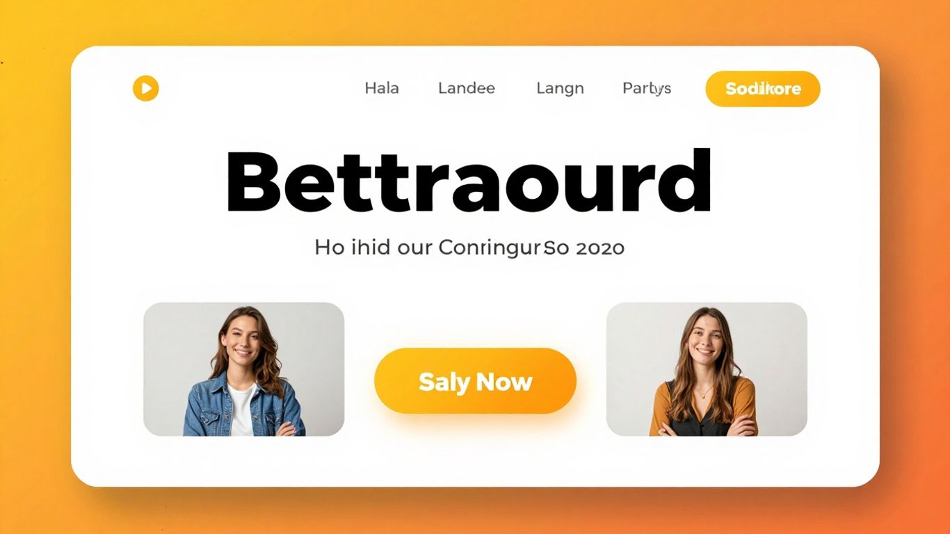
Hero Image
Okay, so you’ve got a killer headline, but what’s the first thing someone really sees when they land on your page? It’s the hero image, or sometimes a video. This is your big first impression, so it needs to count.
Think of it as the visual handshake. It should immediately give people a feel for what you’re offering and why they should stick around. Instead of just a generic picture, try to show your product or service in action. How does it actually work? What problem does it solve? Make it easy for visitors to picture themselves using it and getting the good stuff out of it.
Here’s why it’s so important:
- Grabs Attention: A good visual stops people from scrolling past.
- Communicates Quickly: It can show what you do way faster than text alone.
- Builds Connection: Seeing a product used or a happy customer can make it feel more real.
Avoid those cheesy stock photos if you can. People can spot them a mile away, and they don’t really say much. If you sell software, show a clean screenshot of the best part. If it’s a physical product, show it being used in a real-life setting. For a service, maybe a short video of someone benefiting from it.
The goal here is to make the visitor think, “Oh, that looks like it could help me!” It’s about showing, not just telling, and making that visual instantly understandable and appealing.
Benefits
So, you’ve got their attention with a killer headline and shown them what makes you special. Now what? You gotta tell them why they should care. This is where you lay out the good stuff – the benefits. Think about what your product or service actually does for the person looking at your page. Don’t just list features; explain how those features make their life easier, solve a problem, or help them reach a goal.
People buy solutions, not just products. They want to know how you’re going to make things better for them. Are you saving them time? Money? Stress? Helping them look good? Whatever it is, make it crystal clear.
Here’s a quick way to think about it:
- Feature: Our software has an automated reporting tool.
- Benefit: This means you get instant, easy-to-understand reports without spending hours compiling data, freeing up your time for more important tasks.
- Feature: We offer 24/7 customer support.
- Benefit: Get help whenever you need it, day or night, so you’re never stuck with a problem for long and can keep your business running smoothly.
- Feature: Our product is made from sustainable materials.
- Benefit: Feel good about your purchase knowing you’re supporting an eco-friendly choice that’s better for the planet.
Sometimes, listing out the direct advantages can feel a bit dry. Try to paint a picture of the positive outcome. Instead of just saying ‘saves money,’ you could say ‘puts more cash back in your pocket for things you actually enjoy.’ It’s about connecting with their desires and needs on a more personal level.
Social Proof
People are naturally hesitant to be the first to try something new. They want to see that others have already taken the plunge and found success. That’s where social proof comes in. It’s all about showing potential customers that real people, just like them, have used your product or service and had a positive experience. This builds trust and significantly lowers uncertainty.
Think about it: would you rather buy from a company with no reviews, or one with hundreds of glowing testimonials? It’s a no-brainer. Incorporating social proof isn’t just a nice-to-have; it’s a powerful conversion booster. According to some marketing insights, it’s one of the most effective ways to get people to take action on your landing page.
Here are some ways to weave social proof into your landing page:
- Customer Testimonials: Feature quotes or short stories from satisfied clients. If possible, include a photo or even a video of the customer. Seeing a real face makes the testimonial much more believable.
- Star Ratings: If your product or service has ratings, display them prominently. A 4.5-star average speaks volumes.
- Client Logos: If you’ve worked with well-known brands, showcase their logos. This instantly adds a layer of credibility.
- Case Studies: For more complex products or services, a brief case study showing a problem, your solution, and the positive outcome can be incredibly persuasive.
Building trust is key. When visitors see that others have had a good experience, they feel more confident in making their own decision. It’s like getting a recommendation from a friend, but on a larger scale.
For instance, a company selling software might display logos of major corporations that use their product. Or a local bakery could feature photos of happy customers enjoying their cakes. These little signals add up, making your offer seem more reliable and less risky. Exploring different social proof marketing strategies can give you even more ideas to implement.
Call to Action
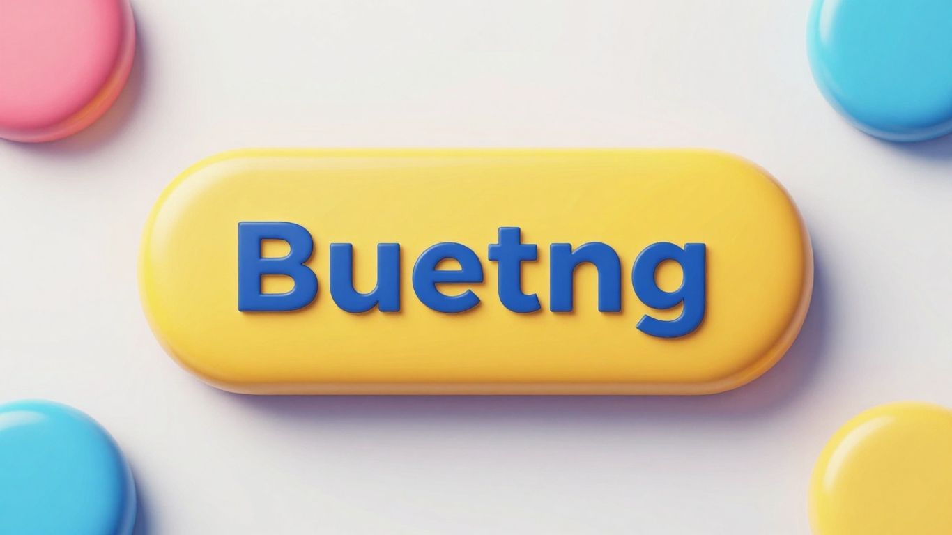
Alright, so you’ve got someone hooked with a great headline, they understand what you’re selling, and they’re feeling good about it. What’s next? You need to tell them exactly what to do. That’s where the Call to Action, or CTA, comes in.
This is the single most important part of your landing page because it’s where the actual conversion happens. Without a clear CTA, your visitors are just going to wander off. Think of it like giving directions – you wouldn’t just say “go that way”; you’d say “turn left at the big oak tree and walk 50 steps.”
Here’s what makes a CTA work:
- Clear and Direct Language: Forget fancy words. Use simple, action-oriented phrases. Instead of “Submit,” try “Get Your Free Guide” or “Start Your Trial Now.” People need to know what they’re getting.
- Visually Obvious: Your CTA button needs to pop. Use a color that stands out from the rest of your page. It should be big enough to tap easily on a phone, too. Nobody wants to hunt for the button.
- Placement Matters: Ideally, put your main CTA “above the fold” – meaning, visible without scrolling. If your page is long, it’s a good idea to put another CTA button near the bottom so people don’t miss it.
A common mistake is having too many CTAs on one page. Stick to one main goal. If you want them to sign up for a webinar, that’s the CTA. Don’t also try to get them to download a PDF at the same time on the same page. Keep it focused.
Think about what you want the visitor to do. Do you want them to buy something? Sign up for a newsletter? Download a resource? Make that crystal clear with your CTA. It’s the final nudge that turns a curious visitor into a lead or a customer.
Mobile Optimization
Let’s face it, most people are browsing the web on their phones these days. If your landing page looks janky or is a pain to use on a small screen, you’re probably losing a lot of potential customers. Making sure your page works well on mobile isn’t just a nice-to-have; it’s pretty much mandatory.
Think about it: when you’re on your phone, you want things to load fast and be easy to tap. Long forms that require tons of typing? Forget it. Tiny buttons that are hard to hit? Nope. Your landing page needs to be designed with the mobile user in mind from the start. This means using a responsive design that automatically adjusts to whatever screen size someone is using. It also means making sure your buttons are big enough to tap without accidentally hitting something else, and keeping forms short and simple.
Here are a few things to check:
- Load Speed: People are impatient on mobile. If your page takes more than a few seconds to load, they’re likely to leave. Aim for under 3 seconds. A 1-second delay can really hurt your conversion rates.
- Readability: Use clear fonts and don’t cram too much text together. Short paragraphs and clear headings make it easier to scan.
- Navigation: Buttons and links should be easy to tap with a thumb. Avoid tiny elements that require precision.
- Forms: Keep them as short as possible. Only ask for the absolute essential information.
A mobile-first approach means you’re designing for the smallest screens first and then scaling up. This helps you prioritize what’s most important and avoid clutter.
It’s not just about looking good, either. Google actually pays attention to how well your site works on mobile when deciding where to rank it in search results. So, getting this right helps with SEO too. Basically, if your landing page isn’t mobile-friendly, you’re leaving money on the table.
Putting It All Together
So, we’ve gone over the main things that make a landing page work. It’s not just about having a nice-looking page; it’s about making sure it does its job. Think about your headline, what makes you different, and how you’re telling people what to do. Adding in pictures that show what you’re about and letting others say good things about you really helps too. Don’t forget to make it easy for people to take the next step. By focusing on these seven points, you’re way more likely to get visitors to actually do what you want them to do. It takes a bit of effort, sure, but seeing those conversion numbers go up is totally worth it.
Frequently Asked Questions
What exactly is a landing page and why is it different from other website pages?
A landing page is a special page on your website made for a specific goal, like getting people to sign up for something or buy a product. Unlike your homepage, which shows everything about your business, a landing page is focused on one thing to help visitors take a specific action.
Why is having a good headline so important on a landing page?
The headline is the very first thing people see. If it doesn’t grab their attention right away and tell them what’s in it for them, they probably won’t stick around to read the rest of your page. It needs to be exciting and clear!
What’s a ‘Unique Selling Proposition’ (USP) and how do I show it?
Your USP is what makes your product or service special compared to others. It’s not about being the *only* one doing something, but about what makes you stand out. You can show your USP in your headline, subheadings, or by highlighting what makes your offer better.
How can images or videos help my landing page convert visitors?
A great picture or video can really catch someone’s eye and help them understand what you’re offering. Showing your product in action or demonstrating its benefits makes it easier for visitors to imagine themselves using it and liking it.
What is ‘Social Proof’ and why should I include it?
Social proof means showing that other people trust and like what you offer. This can be through customer reviews, testimonials, or logos of companies you’ve worked with. It helps new visitors feel more confident about taking action because others have already had a good experience.
Why is it important for my landing page to work well on phones?
Most people use their phones to browse the internet. If your landing page looks messy or is hard to use on a small screen, visitors will get frustrated and leave. Making sure it looks good and is easy to navigate on phones is super important for getting them to take action.


Leave a Reply